|
|
Post by Caveboy0 on Aug 10, 2010 16:54:59 GMT -5
here's the new costume:  i know right? its insane how different it is. i can barely tell its batman  i think the new/old design is awesome. going back to the classic symbol and the new streamlined utility belt looks slick maybe its just me, but i think it also looks darker. i really can't see how batman fans can really complain about this one. The IGN article elaborates on whats new for Batman: comics.ign.com/articles/111/1111462p1.htmlto simplify it this is what i can understand: - When Bruce Wayne returns its just Bruce Wayne he doesn't become Batman again until a little bit longer
- After Bruce becomes Batman again his main new story will take place in Batman, Inc.
- Where he'll be teaming up with other heroes during the first 12 issues of the series.
- This will all lead to some big climax. They also mention how Bruce is "franchising" his legacy. Involving Dick, Knight, Squire, etc all under this Batman team.
- Batman and Robin will continue just without Morrison the new team will be the old creative team for GL Corps which I don't read but I know is pretty good.
- One more new series will pop up called Batman: The Dark Knight. This will be written and drawn by David Finch who made that redesign. There is no information on what this will be about.
- All of this will kick off in October with a series of one shots with the banner "Bruce Wayne- The Road Home" ending with one final one shot called Batman: The Return which will lead into the new Batman titles I mentioned as well as the ongoing ones.
|
|
Jul 23, 2010 18:08:01 GMT -5
mob
Expert Poster
 AN-TI S-O-B, WHOS AN ASSHOLE, NOT ME!
Posts: 1,022
|
Post by mob on Aug 10, 2010 17:41:59 GMT -5
i like it
|
|
|
|
Post by BackinBlack on Aug 10, 2010 18:40:50 GMT -5
It's cool; at least it's not a drastic change like Wonder Woman. I usually prefer the large bat than the yellow oval, but it looks good here; besides, I'm sure Dick will keep it on his suit.
My one complaint though is that it looks a little too similar to the Earth One book design.
|
|
|
|
Post by Caveboy0 on Aug 10, 2010 19:00:17 GMT -5
i guess, but don't all batman designs look the same? i mean when you get down to it batman's costume hasn't changed too drastically like ever.
i don't really mind at all. i think it looks good and thats that.
i think realistically the black bat is more practical, but its just been used for so long that i'm very open to them using the yellow one again i think its cool.
i'm curious to that double ring in the symbol. you think it glows or something? not like a personal bat signal or anything cheesy like that, but like if he's in the shadows you'd see his eyes and also his bat symbol.
|
|
|
|
Post by Webber3000 on Aug 10, 2010 21:02:25 GMT -5
Looks cool... But like Blacky, I tend to like the big black bat on the chest better.
|
|
|
|
Post by Caveboy0 on Aug 10, 2010 21:09:36 GMT -5
you fruits wanting to keep the status quo. accept the change!
|
|
Jul 19, 2010 18:29:02 GMT -5
Spider-Vader
Regular Poster

Posts: 81
|
Post by Spider-Vader on Aug 14, 2010 17:43:51 GMT -5
What's the difference? It's like when Iron Man changes armor. You can still tell it's Iron Man because of the red/gold & blue arc reactor.
|
|
|
|
Post by Caveboy0 on Aug 14, 2010 18:57:02 GMT -5
new sleaker utility belt and going back to the classic symbol. they haven't used that symbol in like 20 years. i'd say its big not really a big difference, i mean i started the thread off with a joke about that. the main point is in speculation. why does he change it. and whats new in batman comcis.
|
|
|
|
Post by BackinBlack on Aug 14, 2010 19:42:25 GMT -5
new sleaker utility belt and going back to the classic symbol. they haven't used that symbol in like 20 years. i'd say its big not really a big difference, i mean i started the thread off with a joke about that. the main point is in speculation. why does he change it. and whats new in batman comcis. 10 years actually. He switched to the big bat after No Man's Land ended. |
|
|
|
Post by Caveboy0 on Aug 14, 2010 23:24:43 GMT -5
i thought he switched in the early 90s
|
|
|
|
Post by Caveboy0 on Aug 17, 2010 15:09:45 GMT -5
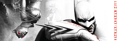
wo! turns out the redesign is a bigger then we imagined:    sooo what do you guys think now? i think it looks a little to flashy now. |
|
May 16, 2024 23:04:55 GMT -5
lopli
Guest
|
Post by lopli on Aug 17, 2010 15:15:20 GMT -5
It looks pretty cool actually
|
|
|
|
Post by Caveboy0 on Aug 17, 2010 15:30:26 GMT -5
i guess i should have asked which interpretation you like best
|
|
|
|
Post by Webber3000 on Aug 17, 2010 17:31:59 GMT -5
wo! turns out the redesign is a bigger then we imagined: sooo what do you guys think now? i think it looks a little to flashy now. I know you disagree, but I like that second interpretation best. It looks really cool. |
|
|
|
Post by Spidey 1923 on Aug 18, 2010 0:39:32 GMT -5
I don't like the lines going down the suit but over than that it looks great.
|
|


 BORN TO BE VIIIIIIHIHIHIRAL!