|
|
Post by Spidey 1923 on Feb 20, 2013 21:34:15 GMT -5
|
|
|
|
Post by mr. excellent on Feb 21, 2013 0:32:11 GMT -5
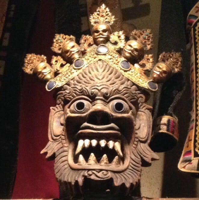
I googled U.S. Presidents, famous physicists, chemists, and mathematicians. No matches came up in my search. I'm thinking this guy is a mathematician for some reason though. Feel like I've seen him before. Probably wrong.
|
|
|
|
Post by Spidey 1923 on Feb 21, 2013 1:45:45 GMT -5
I think it's FDR.
|
|
|
|
Post by Caveboy0 on Feb 21, 2013 12:42:42 GMT -5
yeah pretty sure its FDR
|
|
|
|
Post by mr. excellent on Feb 21, 2013 22:34:55 GMT -5
Ah geez, it is. Good thing I don't teach history.
|
|
|
|
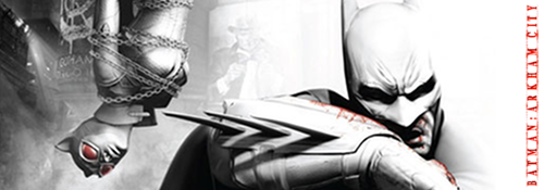
Post by BackinBlack on Feb 25, 2013 9:42:59 GMT -5
Behold, the new Amazing Spider-Man!  I like it, especially the eyes. But I'm gonna admit I feel like it's a step back to use the Raimi design, like the raised webbing. I just hope they explain why he made a new suit, and that he'll still have the webshooters on the outside and a belt for the cartridges. |
|
|
|
Post by Caveboy0 on Feb 25, 2013 10:11:40 GMT -5
going back to the raised and silver webbing was a big mistake in my opinion.
|
|
|
|
Post by Caveboy0 on Feb 25, 2013 10:20:01 GMT -5
my personal issue is how much it looks like the raimi version. fan complaints were honestly ridiculous. all they had to change was making it a more consistent design like he finally made it properly. the texture was great and the in bedded webbing was perfect.
|
|
|
|
Post by Spidey 1923 on Feb 25, 2013 16:45:29 GMT -5
So its Raimi's suit with new eyes and a new emblem photoshopped on? Seriously it even uses the exact same brick pattern on the old suit.
|
|
|
|
Post by Webber3000 on Feb 25, 2013 17:37:51 GMT -5
I agree with Cavey. Raimi's version of the suit just looks too much like a movie prop rather than a realistic practical suit in my opinion.
|
|
|
|
Post by brotherandbassist on Feb 25, 2013 20:27:52 GMT -5
The first movie's suit was a lot more innovative and believable. This looks more like a movie prop. It's just harder to believe Peter made this
|
|
|
|
Post by BackinBlack on Feb 25, 2013 21:04:04 GMT -5
Check it out guys, set pics of the suit: www.comicbookmovie.com/fansites/nailbiter111/news/?a=74754Seeing it in pics like this is pretty awesome. Anyone catch the webshooters? Nice to see they'll still be on the outside, and with a new design to boot. I half expected the back spider to be round, since they're going for more of the comic look and all, but the big spider makes it feel connected to the first film. You know, in some of these shots, you can't even tell the webs are raised. I mean, along with the eyes, it looks like Spidey jumped right off the page. I'm still hoping for a cartridge belt though, even if it's just under the shirt. |
|
|
|
Post by Caveboy0 on Feb 25, 2013 21:34:53 GMT -5
the thing is though that i personally love the big eye design int he comics, but in real life i'm not sure it entirely translates.
and i think webber and lopli nailed it on the head that it looks like a prop.
i do agree though that the raised webber does loock black and much flatter than the raimi suit.
and i kind of like the idea that his suit is looking more cleaner and more professional. kind of like "yeah he's officially spider-man now" i just wish they kept the same ideas that this is a more homemade suit.
|
|
|
|
Post by mr. excellent on Feb 26, 2013 0:24:02 GMT -5
The suit looks much better in the photos posted in your link than in some of the other articles posted on main at CBM. My initial complaint was going to be that the embedded webbing was an interesting direction, and as Caveboy said, the design could have been improved simply by making it a tad more consistent. I don't like that it looks so similar to the Raimi suit because I'd already accepted the new one. As I said though, those photos in the link you posted put the suit in a much nicer perspective for me.
One thing I'm concerned with is the brightness of the suit. The TASM suit popped in a really nice way; it captured the light beautifully even in the night sequences. I remember the suit almost looked too bright in the pre-production shots. This one looks a lot darker, like the pre-production photos for the Raimi suit, but then again that one popped just fine.
I don't much like the front Spider, it seems to conflict with the back spider's design, but overall this is one of the truest comic book costume interpretations I've seen. It's also similar looking to the Edge of Time design.
|
|
|
|
Post by brotherandbassist on Feb 26, 2013 0:27:16 GMT -5
The suit looks much better in the photos posted in your link than in some of the other articles posted on main at CBM. My initial complaint was going to be that the embedded webbing was an interesting direction, and as Caveboy said, the design could have been improved simply by making it a tad more consistent. I don't like that it looks so similar to the Raimi suit because I'd already accepted the new one. As I said though, those photos in the link you posted put the suit in a much nicer perspective for me. One thing I'm concerned with is the brightness of the suit. The TASM suit popped in a really nice way; it captured the light beautifully even in the night sequences. I remember the suit almost looked too bright in the pre-production shots. This one looks a lot darker, like the pre-production photos for the Raimi suit, but then again that one popped just fine. I don't much like the front Spider, it seems to conflict with the back spider's design, but overall this is one of the truest comic book costume interpretations I've seen. It's also similar looking to the Edge of Time design.^ this. I knew it looked really familiar |
|